Legendary Canadian whisky producer J.P. Wiser’s is always raising the bar.
With a legacy spanning over 165 years, the iconic brand has been a leader in the Canadian Whisky category since its inception, thanks to its intricate distilling process, smooth style, and unparalleled creations.

And now, it’s charging forward with a transformation that celebrates its Canadian heritage, while giving it a bold new look.

The iconic whisky brand has partnered with international design agency JDO to create a new and revitalized image, while retaining the same perfectly-balanced flavour profiles whisky lovers have come to know and appreciate.
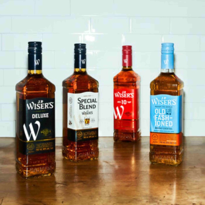
The brand refresh exudes simplicity and confidence, with an updated logo that features modern typography and a colour palette that pays homage to the brand’s industrial origins.
This is coupled with two new brand symbols, a big “W” that will be a common thread in the J.P. Wiser’s family, and an icon of a horse rearing over a barrel, a nod to the brand’s illustrious past and a tribute to the J.P. Wiser’s quote: “Horses Should Hurry But Whisky Must Take Its Time.”